
The SAT represents a digital gateway to numerous collegiate aspirations. As the examination evolves, so too does our approach to it. A modern, computer-based format has replaced the traditional method of filling in answers on paper. This transition encompasses all sections of the test, including the mathematics portion. Here, you will encounter a familiar challenge: the interpretation of graphs and charts.
Before getting into the details of SAT math graph questions, let’s learn its importance in the Digital SAT.
Importance of Charts and Graphs Questions in SAT
These visual elements might initially seem intimidating, but there’s nothing to be afraid of! Their purpose remains the same – to assess your ability to interpret data and solve problems.
Mastering SAT math graph questions on the digital SAT is just as crucial for success as it is on the paper-based version.
Here’s why:
- Future-Proofing Your Skills: The digital SAT reflects the growing importance of data analysis in all academic disciplines. By honing your graph and chart skills now, you’ll develop a valuable asset for future academic success.
- Unlocking Hidden Insights: Don’t be fooled by their digital format – these graphs and charts still hold valuable information. By understanding how to analyze them effectively, you’ll be able to extract key data and solve problems efficiently, just like you would with a traditional paper graph.
- Boosting Your Digital Confidence: Conquering these digital graph questions builds confidence in your overall math abilities. The more comfortable you become with analyzing them on screen, the less intimidating the digital format will seem, allowing you to focus on the task at hand.
Remember, the SAT is designed to assess your college readiness, and data analysis is a vital skill for academic success. By embracing the digital format and mastering these graph and chart questions, you’ll demonstrate not only your math prowess but also your ability to thrive in a digital learning environment.
So, the next time you encounter digital SAT math graph questions, remember – it’s not just a visual distraction; it’s an opportunity to showcase your analytical skills and shine!
Now, let’s move on to the next section, where we discuss strategies for solving Graphs and Chart questions on the SAT.
Want to know more about Digital SAT? Click here!
General Strategies for Tackling Graphs and Charts Questions
The SAT has gone digital, but the core challenges remain. Among them are those ever-present graphs and charts in the math section.
Now presented on a screen, these visual puzzles might seem like a whole new ball game. The strategies you need to conquer them remain the same.
Here’s a list of strategies that you will need to solve the digital SAT math graph questions:
Understanding the Basics: titles, keys, labels, and units
The first step is understanding the interface. While the graphs themselves might not differ significantly from their paper counterparts, the digital format introduces a few new things.
Familiarize yourself with the tools for zooming in, panning, and interacting with the graph. Remember, these features are there to help you—use them to your advantage!
Next, revisit the fundamentals of graph analysis. Titles, keys, labels, and units are still your guiding lights. Titles tell you the story, keys translate the symbols, labels mark the axes, and units tell you what you’re measuring (dollars, percentages, or something else).
By mastering this digital map, you’ll be well on your way to unearthing the graph’s hidden data.
Understanding the Questions and Learning Elimination Strategy
Just like in the paper-based SAT, the question is your ultimate guide. Read it carefully; it will clearly outline what the test makers want you to find in the digital graph.
Here’s where your elimination skills come into play. Often, answer choices contain blatant outliers or values contradicting the data presented on screen. By systematically eliminating these options, you can narrow down the possibilities and increase your chances of finding the correct answer.
Understanding Trends, Patterns, Outliers, and Relationships within the Data
Look for trends. Are there patterns in how the lines move, or do the bars rise and fall? Are there any outliers that seem to stand out from the crowd? Identifying these trends and anomalies is crucial for cracking the code.
Remember, the data within the graph holds the key to unlocking the answer. Pay close attention to the relationships between different elements.
Does one variable increase as another decreases? Are there any intersections or points of significance that might be relevant to the question? By utilizing the digital tools at your disposal, you’ll be well on your way to conquering those digital graphs and charts.
Mastering these core strategies will equip you to face the digital SAT’s graphs and charts with confidence. Remember, the more you practice analyzing these visual representations of data, the more comfortable and efficient you’ll become.
So, take up as many practice tests as you want from LearnQ.ai, and get ready to dominate those on-screen graphs and charts!
Now, let’s look at the common charts and graphs of the questions asked in the digital SAT.
Also Read: Crucial Tips and Tricks to Effectively Utilize SAT Math Reference Sheet
Common Types of Graphs and Charts in the Digital SAT Math Section
Having conquered the basics of SAT math graph questions, it’s time to get into details. The test makers love to throw various graph types at you, each with its own storytelling method.
Here’s your field guide to the most common digital graph and chart suspects you’ll encounter in the Math section:
Scatterplots
If you see a constellation of dots on your screen – that’s a scatterplot. Each dot represents a data point, and by analyzing their position, you can uncover hidden relationships. These graphs are like crystal balls, allowing you to predict trends and make informed guesses about future values.
The SAT might ask you to identify correlations between variables, find the line of best fit, or even predict a missing data point based on the existing scatter.
Bar Graphs & Histograms
Have you ever wondered how many students scored within a certain range on the SAT? Bar graphs and histograms are the answer. These digital bars paint a picture of data frequency. The height or length of each bar represents the number of occurrences within a specific category.
The SAT might ask you to compare frequencies, identify the most frequent category, or calculate probabilities based on the data displayed in these colorful bars.
Line Graphs
Line graphs illustrate how a value changes over time. Imagine tracking a company’s stock price growth or the temperature fluctuations throughout the day.
Line graphs on the SAT might ask you to interpret trends (is the line going up, down, or staying flat?), calculate rates of change (how much is the value increasing or decreasing?), or even predict future values based on the established trend.
Two-Way Tables
A two-way table uses rows and columns to display how data is distributed across different categories. Think eye color versus hair color or student scores on math versus reading. The SAT might ask you to calculate percentages based on the data displayed in the table, compare values across rows or columns, or even identify relationships between the two variables being categorized.
Understanding the unique language of each graph type will help you decipher its messages.
Remember, these graphs and charts are just different ways of presenting information. Once you learn to interpret them effectively, you’ll easily ace the digital SAT’s Math section!
Also Read: Practice Digital SAT Math: Geometry Questions and Answer Workbook
Reading and Analyzing Scatterplots
The digital SAT throws a variety of graphs your way, and scatterplots are some of the most intriguing.
This section will equip you with the tools for effectively interpreting scatterplots within the digital SAT Math section.
Interpreting the best fit, slope, and y-intercept line
Imagine a line weaving its way through the cloud of data points – the line of best fit. It doesn’t necessarily touch every point, but it does represent the overall trend of the data. The steeper the slope of this line, the stronger the relationship between the variables.
A positive slope indicates that as one variable increases, the other also tends to increase. Conversely, a negative slope suggests that as one variable goes up, the other tends to go down.
The y-intercept, where the line crosses the y-axis, tells you the predicted value of the y variable when the x variable is zero.
Identifying outliers
Sometimes, you’ll encounter a data point that seems to be way off on its own. These are outliers, and they can throw a wrench into your analysis if you’re not careful.
The SAT might ask you to identify outliers, but be cautious! Not every point that seems far away is necessarily an outlier.
Consider the context – does the outlier have a legitimate explanation, or is it likely a result of measurement error or some other anomaly?
Example
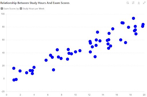
The scatterplot below depicts the relationship between study hours per week (x-axis) and exam scores (y-axis) for a group of students.
Question:
Based on the scatterplot, is there a positive, negative, or no clear relationship between study hours and exam scores?
Explanation:
Scatterplots reveal the distribution of data points for two variables. By analyzing the overall pattern of the points, we can identify potential relationships.
Here’s how to approach this question:
- Look for a general trend: Do the points tend to move upwards (positive relationship), downwards (negative relationship), or appear randomly scattered (no clear relationship)?
- Consider the direction of the “cloud” of points: If the majority of points drift upwards as you move to the right, there’s a positive association. If they drift downwards, it’s a negative association.
In this example, the scatterplot shows a positive trend. As the study hours increase (moving to the right on the x-axis), the exam scores generally tend to increase as well (moving upwards on the y-axis). There might be some variation (not all points fall perfectly on a line), but the overall pattern suggests a positive association.
Answer:
Therefore, based on the scatterplot, there is a positive relationship between study hours and exam scores.
By understanding the line of best fit, slope, y-intercept, and how to identify outliers, you’ll be well on your way to cracking the code of scatterplots in the digital SAT.
Remember, the more you practice analyzing these data constellations, the more confident you’ll become in deciphering their hidden messages and solving related problems on the test!
Also Read: SAT Math Tips and Tricks to Boost Your Score
Bar Graphs and Histograms
The digital SAT Math section thrives on data visualization, and bar graphs and histograms are two key tools used to present information. While seemingly simple, understanding how to interpret them is essential for test success.
Master the Basics of Bar Graphs: Titles, Labels, and Bars
Imagine a vibrant cityscape where buildings represent categories. Their height signifies frequency – how often each category appears in the data. This makes bar graphs ideal for comparing quantities across groups.
Key Elements:
- Title: The headline summarizing the data’s theme.
- X-Axis: Labels the categories being compared (e.g., student grades, car models).
- Y-Axis: The frequency scale – how many times each category occurs (e.g., number of students, number of cars sold).
Example:
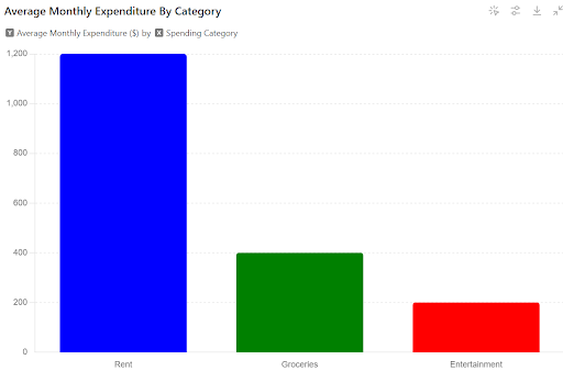
The bar graph below depicts the average amount spent on different categories (rent, groceries, entertainment) in a monthly budget for a group of young professionals. The x-axis represents the spending category, and the y-axis represents the average monthly expenditure in dollars.
Here, the height of the “Rent” bar should be the highest, followed by “Groceries” and then “Entertainment.”]
Question:
Based on the bar graph, which category has the highest average monthly expenditure?
Explanation:
Bar graphs represent data through the heights of bars for different categories. The higher the bar, the greater the value for that category.
Here’s how to approach this question:
- Compare the heights of the bars: Visually identify the bar that extends the highest on the y-axis.
- Read the category labels: Match the highest bar to its corresponding category on the x-axis.
In this example, the “Rent” bar has the greatest height on the y-axis.
Answer:
Therefore, based on the bar graph, the category with the highest average monthly expenditure is Rent.
Using Histograms to Identify Average Values in a Dataset
Similar to bar graphs, histograms visualize data distribution. However, instead of distinct categories, they focus on a continuous range.
Think of a city skyline with buildings of varying heights representing the frequency of data points within specific value ranges (e.g., student test scores and household income).
Key Elements:
- Title: Provides context for the data distribution.
- X-Axis: Represents the continuous variable being measured (e.g., test scores, income).
- Y-Axis: The frequency scale – how many data points fall within a specific range on the x-axis (e.g., number of students, number of households).
Example
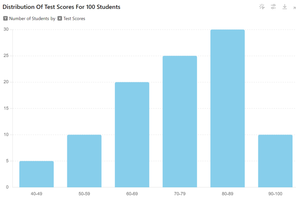
The histogram below depicts the distribution of test scores for a group of 100 students. The x-axis represents test scores (ranging from 40 to 100), and the y-axis represents the number of students who scored within each range.
Question
Based on the histogram, what is the most likely range for the average test score?
Explanation:
While histograms don’t provide the exact average, they reveal the distribution of data points. By analyzing the bars, we can estimate where the average score might fall.
Here’s how to approach this question:
- Identify the “hump” of the histogram: This represents the range where most students scored.
- Look at the surrounding bars: Are the bars on either side of the “hump” roughly the same height, or do they slope off dramatically?
In this example, the “hump” appears to be around the 70-79 range. The surrounding bars (60-69 and 80-89) are also relatively high, suggesting that a significant portion of students scored in this general area.
Answer:
Therefore, based on the histogram, the most likely range for the average test score is 70-79.
Mastering these visualizations will train you more for the digital SAT. The more you practice, the more confident you’ll become in tackling these challenges!
Line Graphs
The digital SAT Math section frequently employs line graphs to represent the dynamic relationships between two variables over time. These visual representations allow for the examination of trends and the prediction of future values.
Here, we will explore the core principles of interpreting line graphs within the context of the digital SAT.
Tracking Changes Over Time Between Two Variables with Line Graphs
Line graphs depict change along two axes.
The horizontal or x-axis typically represents time, measured in units such as days, weeks, or months. The vertical or y-axis represents the changing value of another variable, which could be anything from temperature to sales figures.
Let’s try to understand with an example.
Example
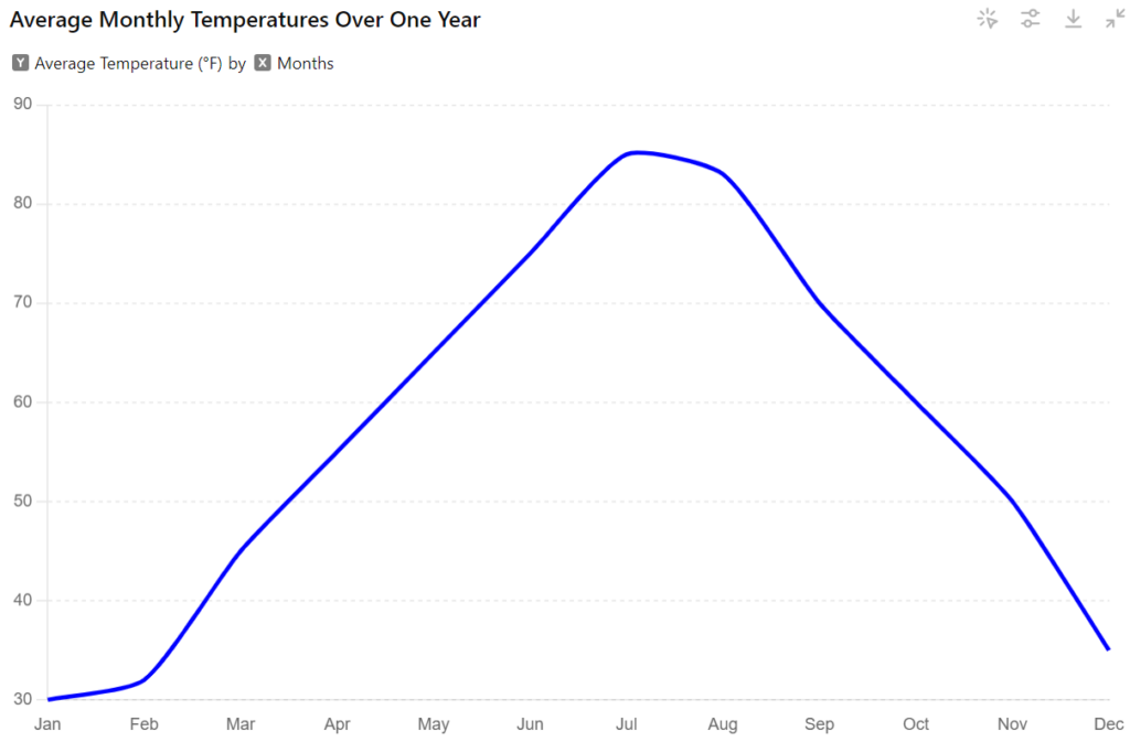
The line graph below depicts the average monthly temperatures (in degrees Fahrenheit) for a particular city over a one-year period. The x-axis represents the months (January to December), and the y-axis represents the average monthly temperature.
Question:
Based on the line graph, what is the general trend in average monthly temperatures throughout the year?
Explanation:
Line graphs showcase changes over time. By analyzing the slope of the line, we can identify trends.
Here’s how to approach this question:
- Trace the line: Is the line generally sloping upwards (increasing temperatures), downwards (decreasing temperatures), or relatively flat (no significant change)?
- Consider the starting and ending points: Are the temperatures at the beginning and end of the year significantly different?
In this example, the line starts at a lower point (presumably representing colder temperatures) and gradually slopes upwards. This suggests an increasing trend in average monthly temperatures throughout the year.
Answer:
Therefore, based on the line graph, the general trend in average monthly temperatures throughout the year is increasing.
By analyzing the trajectory of the line itself, we can identify trends, calculate rates of change, and ultimately make informed predictions about future values.
The SAT might utilize line graphs in several ways:
- Identification of Trends: Does the data suggest a seasonal pattern in sales figures? Are there specific months when sales consistently peak?
- Calculation of Rates of Change: What is the average monthly increase or decrease in sales? This can be determined by analyzing the slope of the line.
- Prediction of Future Values: Based on the established trend, can we make predictions about sales figures in forthcoming months?
Analyzing Two-Way Tables
The digital SAT Math section isn’t limited to graphs and charts. Sometimes, the data arrives in a more organized format – the two-way table.
Think of it as a spreadsheet on your screen, where rows and columns work together to reveal how data is distributed across different categories. Mastering this format is essential for tackling distribution-related problems.
Techniques for analyzing data distribution with two-way tables
Before getting into complex calculations, take a moment to familiarize yourself with the table’s structure.
Each row and column will have a title, providing context for the data being categorized. These titles are like signposts, guiding you through the information landscape.
For instance, a two-way table might analyze eye color and hair color, with rows representing eye color options (brown, blue, green) and columns representing hair color options (blonde, brunette, redhead).
Emphasizing Column and Row Titles and Totals for Swift Analysis
Many two-way tables will have marginal totals along the edges. These summarize the overall distribution of data across each category.
By analyzing these totals alongside the individual values within the table, you can gain a quick understanding of how frequently each category appears in the data set.
Example
Below is a two-way table where rows represent age groups (18-24, 25-34, 35-44, and 45-54) and columns represent gender (male, female). The table also includes marginal totals for each row and column, indicating the total number of individuals within each age group and gender category.
Here is the two-way table based on the above information:
| Age Group | Male | Female | Total |
| 18-24 | 120 | 130 | 250 |
| 25-34 | 140 | 150 | 290 |
| 35-44 | 130 | 120 | 250 |
| 45-54 | 110 | 100 | 210 |
| Total | 500 | 500 | 1000 |
To find the probability of selecting a male individual between the ages of 25 and 34:
- Find the relevant cell value: 140 (males aged 25-34).
- Consider the total number of individuals: 1000.
The probability is calculated as:
Probability= 1401000=0.14 or 14%
By analyzing the relevant cell value within the table and considering the corresponding marginal totals, you can calculate this probability effectively.
Mastering two-way tables equips you to analyze data distribution with confidence. Remember, the more you practice interpreting these structured representations, the more prepared you’ll be to tackle them in the digital SAT Math section.
Also Read: Essential Math Notes, Guide, and Facts
Digital SAT Math: Advanced Graph Types and Their Analysis
The digital SAT Math section demands a multifaceted approach to data visualization. While bar graphs and line graphs form the foundation of graphical representation, the test can also get into more intricate graph types that necessitate a deeper comprehension of mathematical concepts. Here, we embark on a journey to equip you with the tools necessary to conquer these advanced adversaries.
Cartesian Graphs
Cartesian graphs, also known as coordinate graphs, utilize a two-dimensional coordinate system with the x and y axes serving as the primary axes. Each point on this grid corresponds to a solution of the given equation, transforming the abstract world of algebraic expressions into a visually comprehensible representation.
The SAT might present you with the following challenges:
- Correlating Equations with their Corresponding Graphs: Through meticulous analysis of the equation’s properties, such as intercepts and slopes, you will be tasked with identifying the corresponding graph displayed on the digital interface.
- Sketching the Graph of a Presented Equation: This challenge necessitates the translation of the mathematical language embodied by the equation into a visual representation on the coordinate plane.
Example
You are presented with the following equation: y = 2x + 1
The digital interface will also display a coordinate plane (Cartesian graph) with labeled axes (x-axis and y-axis).
Question:
Which of the following points lies on the graph of the equation y = 2x + 1?
(a) (-1, 1)
(b) (0, 1)
(c) (1, 3)
(d) (2, 5)
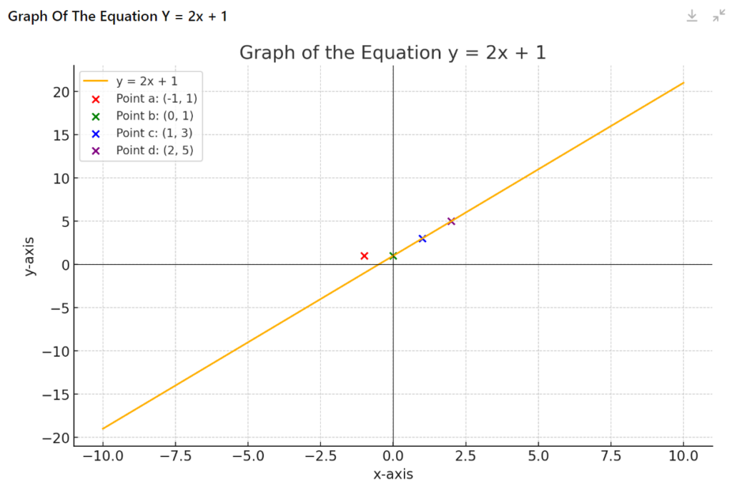
Explanation:
Cartesian graphs depict the solutions of an equation visually. Each point on the graph corresponds to a pair of values (x, y) that satisfy the equation.
Here’s how to approach this question:
- Evaluate each answer choice: Substitute the x-value of each answer choice into the equation and solve for y.
- Compare the calculated y-value to the y-value in the answer choice: If the calculated y-value matches the y-value in the answer choice, then that point lies on the graph.
Answer:
Let’s evaluate each answer choice:
(a) (-1, 1): y = (2)(-1) + 1 = -1 + 1 = 0 (Doesn’t match)
(b) (0, 1): y = (2)(0) + 1 = 0 + 1 = 1 (Matches)
(c) (1, 3): y = (2)(1) + 1 = 2 + 1 = 3 (Matches)
(d) (2, 5): y = (2)(2) + 1 = 4 + 1 = 5 (Matches)
Therefore, the points (0, 1), (1, 3), and (2, 5) all lie on the graph of the equation y = 2x + 1.
However, the question asks for only one answer, so you would choose the first matching answer choice, which is (b) (0, 1).
Function Graphs
Function graphs depict the relationship between two variables within the context of a function, which can be conceptualized as a mathematical entity that takes an input value and produces a corresponding output value. The SAT will likely focus on well-established functions such as linear, quadratic, and exponential functions.
However, the true complexity lies in comprehending how these foundational graphs can be transformed. Imagine manipulating the graph by stretching, compressing, or flipping it – the SAT might ask you to discern these transformations and predict the resulting equation.
Example
The digital interface displays the graph of a quadratic function. The graph is a smooth curve that opens upwards (like a bowl facing the sky).
Question:
Which of the following equations could represent the graph displayed?
(a) y = x^2 + 2x – 3
(b) y = -2x^2 + 1
(c) y = x^2 – 4x + 5
(d) y = -x^2 – 3x + 2
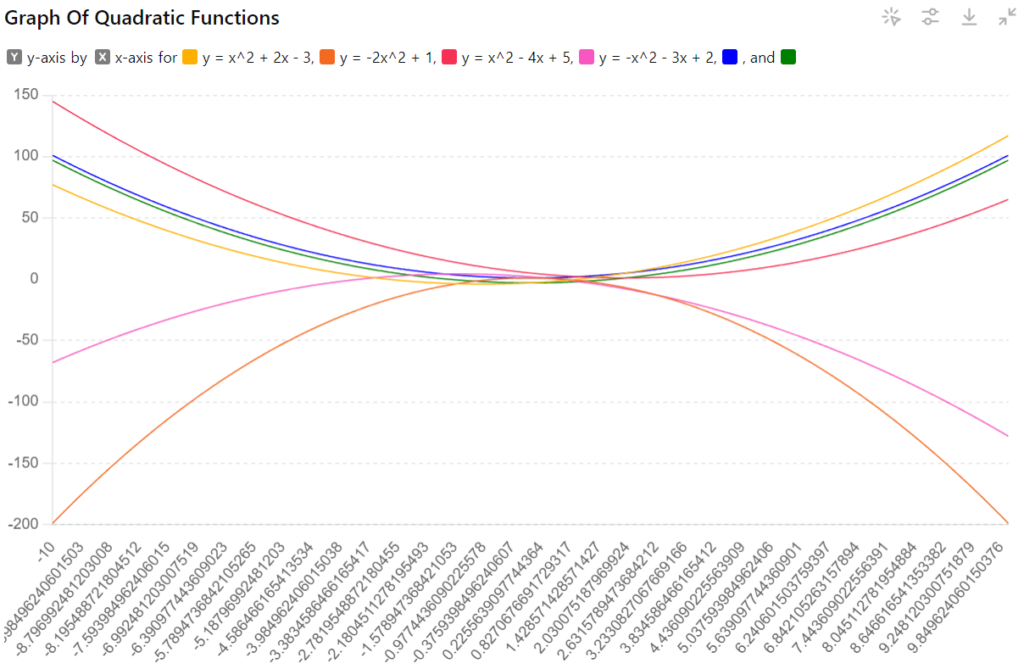
Explanation:
Function graphs depict the relationship between an input value (x) and its corresponding output value (y) according to a specific function. The shape and characteristics of the graph can provide clues about the underlying equation.
Here’s how to approach this question:
- Analyze the graph’s shape: Since the graph is a smooth curve opening upwards, it represents a quadratic function with a positive leading coefficient (the term that includes x^2).
- Consider the y-intercept: The y-intercept is the point where the graph crosses the y-axis (x = 0). Look at the graph to estimate the y-intercept’s position (positive or negative).
- Examine answer choices: Eliminate options that don’t match the overall shape (upward parabola) or the y-intercept position.
Answer:
By analyzing the graph, we can see that it’s a parabola opening upwards and likely intersects the y-axis above the origin (positive y-intercept).
- Option (a): This equation has a positive leading coefficient, aligning with the upward parabola shape. However, it also has a linear term (2x) that could cause a slant, which isn’t observed in the graph.
- Option (b): This equation has a negative leading coefficient, resulting in a parabola opening downwards, which doesn’t match the graph.
- Option (c): This equation has a positive leading coefficient and a linear term (-4x), which could contribute to a slight slant. However, it’s a possibility to consider.
- Option (d): This equation has a negative leading coefficient, resulting in a parabola opening downwards, which doesn’t match the graph.
Based on our analysis, options (b) and (d) can be eliminated due to the negative leading coefficient. Option (a) might be a possibility, but it could have a slant that isn’t observed in the graph.
Therefore, option (c) (y = x^2 – 4x + 5) is the most likely candidate, as it has a positive leading coefficient and a linear term that could potentially create a slight upward slant, which might not be visually prominent on the digital interface.
Also Read: An Overview of SAT Maths Formulas, Questions, and Strategies
Next Steps in Mastery of Graphs and Charts Questions
The digital SAT Math graph questions section throws a variety of graphical challenges your way. While you’ve now acquired a formidable arsenal of skills for deciphering bar graphs, histograms, line graphs, two-way tables, and even advanced graph types, the journey to mastery doesn’t end here.
Here’s your roadmap for solidifying your expertise and facing the SAT with confidence:
Sharpening Your Skills with LearnQ.ai
Data analysis fluency is a game-changer; consistent practice is your ticket to mastering it. Don’t let your newfound knowledge sit idle – it’s time to implement it!
Here are some ways to keep those analytical muscles in top shape with LearnQ.ai:
- Play & Practice Tests: Dive right in with our engaging “Play & Practice” mode. Explore a diverse range of graph and chart-based problems specifically designed for the SAT. This interactive environment allows you to test your skills and identify areas for improvement in a low-pressure setting. Get a feel for the digital SAT format and build your confidence before tackling full-length practice tests.
- Meet Mia, Your AI Tutor: LearnQ.ai goes beyond rote memorization. Our innovative AI tutor, Mia, personalizes your learning journey. Mia analyzes your performance, pinpoints your strengths and weaknesses, and tailors practice problems and explanations to address your specific needs. Get the targeted support you deserve to excel in graph analysis.
- Full-Length Practice Tests: Ready to simulate the real SAT experience? Our extensive library of official, College Board-approved full-length practice tests allows you to refine your graph analysis skills under realistic test conditions. Immerse yourself in the digital SAT format, manage your time effectively, and identify any lingering knowledge gaps before test day.
- Diagnostic Tests: Unsure where to begin? Take our comprehensive diagnostic test to receive a personalized assessment of your current SAT readiness. This insightful tool identifies your strengths and weaknesses across all math sections, including graph analysis. With this valuable data, you can create a targeted study plan and prioritize areas that require the most attention.
Beyond Practice:
LearnQ.ai provides more than just practice tests. We offer a comprehensive suite of resources to elevate your learning:
- Interactive Visualizations: Go beyond static images! Engage with dynamic graphs and charts to solidify your understanding of how data is presented and analyzed. Explore different data sets and manipulate variables to grasp the concepts truly.
- In-Depth Explanations: Don’t just get the answer – understand the “why” behind each problem. Our detailed explanations, powered by Mia’s AI, break down complex graph analysis concepts into clear, actionable steps. Learn from your mistakes and better understand the underlying mathematical principles.
- Adaptive Learning Technology: LearnQ.ai’s intelligent platform constantly adapts to your learning pace. The system identifies knowledge gaps and focuses on areas that require the most improvement. With each practice session, you’ll move closer to mastering graph analysis on the SAT.
Don’t settle for just practice – elevate your learning with LearnQ.ai!
Sign up for free and unlock your full potential on the digital SAT.
The LearnQ Editorial Team is made up of certified Digital SAT tutors, college admissions specialists, and AI education researchers. Our tutors have personally helped over 10,000 US high school students improve their SAT scores, with an average improvement of 150+ points. We combine hands-on tutoring expertise with AI-powered insights from the LearnQ platform, which has analyzed millions of Digital SAT practice questions. Every article we publish is reviewed against the latest College Board Bluebook guidelines and cross-checked with real student performance data. Our mission is simple: give every student the same quality of prep that was once only available at expensive tutoring centers.

